What is Your Cosmic Connection to the Elements?
The lines in the spectrum of an element represent the energy released when an electron makes a transition between atomic energy levels.
Different elements have different patterns of lines because each element has different atomic energy levels.
The elements can "sound" differently depending on which high or low notes the spectral lines fall.
This model differs from true emission line patterns in at least these ways:
-
On a normal piano keyboard, it is difficult to portray the different intensities of the lines.
In the visual spectrum, blue may be on the left, and red on the right (if plotted by wavelength, where smaller wavelength values are on the left). Higher light frequencies are at the blue end of the spectrum. In this mapping onto the piano keyboard, high frequency light is mapped onto the low frequency sounds.
Cosmic Abundances
- The abundances can be read directly from Figure 7, keeping in mind that the logarithm of the abundances is plotted.
- If NH represents the abundance of hydrogen, then the plots shows Log NH = 12. Inverting the logarithm gives the abundance of hydrogen as NH = 1012.
- Likewise, Log NHe = 11, and NHe = 1011,
- Log NAl = 6.5, and NAl = 3.16 x 10⁶,
- Log NAu = 1.0 (estimating from the plot) and NAu = 10. To compare the abundance of an element relative to hydrogen, take the ratio of the abundances:
- To compare the abundance of helium to that of hydrogen, compute 1012/1011 = 10. So there is 10 times more hydrogen than helium. This can also be done using logarithms,
Log (NH/NHe) = Log NH - Log NHe = 12 - 11 = 1.Inverting the result gives Log 1 = 101 = 10.
- Likewise, for hydrogen and aluminum, compute 1012/(3.16 x 106) = 3.16 x 10⁵, or
Log (NH/NAl) = Log NH - Log NAl = 12 - 6.5 = 5.5,There is log 5.5 = 105.5 = 3.16 x 10⁵ times as much hydrogen as aluminum.
- For hydrogen and gold, compute 1012/10 = 1 x 10¹¹, or
Log (NH/NAu) = Log NH - Log NAl = 12 - 1 = 11,There is log 11 = 1 x 10¹¹ times as much hydrogen as gold.
- If NH represents the abundance of hydrogen, then the plots shows Log NH = 12. Inverting the logarithm gives the abundance of hydrogen as NH = 1012.
- Because of the wide range of values, data like this are often plotted logarithmically. The Solar System abundance bar graph is an example of this. These values may likewise be plotted in a bar graph, or as a line graph, with the y-axis for the abundance plotted logarithmically.
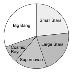
Another way to plot it is to add all the logarithmic values (12+9+8+6+3=38), and represent each particular process as a fraction of the total. So H and He from the big bang are 12/38=32 % of the total. A pie chart can be constructed to represent these percentages. This is what's been done along the rim of the circle on the "What is Your Cosmic Connection to the Elements?" poster.
|
| Pie chart representing the "logarithmic percentages" of each process. |
![]()

![]()