Student Worksheet: Graphing Spectra
Solution for Graphing Spectra Student Worksheet, Part I
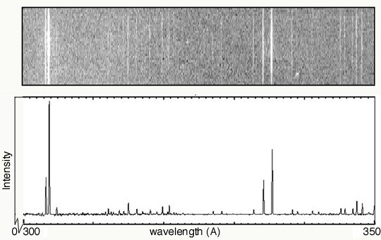
Below are the answers to the "Think About" questions.
- As you move along the wavelength axis from 300 angstroms to 350
angstroms, what will happen to the amount of energy emitted by the
source? Explain why.
The energy decreases. This is because the energy is inversely proportional to the wavelength: E = hc/l
- In the second spectrum, explain why the emission lines are at
different heights.
The varying heights represents the different intensities of the lines. The lines in the left-most portion of the spectrum are brighter than any of the others.
- In order for the bottom plot to include more
"quantitative" data, what variable should go along the y axis?
The y-axis should be labeled as "Intensity".
- How is this variable illustrated in both graphs?
In the top image, it is represented by the brightness of the line. In the bottom plot, it is represented by the height of the line.
- Describe how the second spectrum would
look if it was a function of energy (instead of wavelength).
Keeping the usual sense of values increase from left to right, the order the emission lines would be flipped left-to-right. That is, the brightest lines would be on the right.
- What types of information are gathered from both
spectra?
From the spectra, we can identify the emission lines. With knowledge of the characteristic emission lines of various elements, we could then identify the elements giving rise to this spectrum.
Solar UV Spectra
|