Follow this link to skip to the main content

Student Worksheet: Graphing Spectra

Graphing Spectra - A Student Worksheet

Part I.

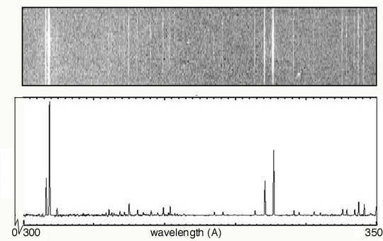
Below are two examples of the same emission spectrum. The first example is without any "quantitative" data, while the second shows light energy as a function of wavelength. The x-axis has the same units (wavelength, in this case, although frequency or energy could also be used) in both cases, and it runs from 300 to 350 angstroms. In your group, discuss the following questions, then write individual answers on paper.

  • As you move along the wavelength axis from 300 angstroms to 350 angstroms, what will happen to the amount of energy emitted by the source? Explain why.

  • In the second spectrum, explain why the emission lines are at different heights.

  • In order for bottom plot to include more "quantitative" data, what variable should go along the y axis?

  • How is this variable illustrated in both graphs?

  • Describe how the second spectrum would look if it was a function of energy (instead of wavelength).

  • What types of information are gathered from both spectra?

Solar UV Spectra

photo and graph representation of solar UV spectrum


A service of the High Energy Astrophysics Science Archive Research Center (HEASARC), Dr. Andy Ptak (Director), within the Astrophysics Science Division (ASD) at NASA/GSFC

NASA Logo, National Aeronautics and Space Administration
Goddard