Different Graphical Representations of Spectra
Different Graphical Representations of Spectra
Visible light spectra can be shown as images, as in the spectra below. These spectra represent energy emission as lines, with the intensity of the line (or the number of photons emitted at a particular energy) represented by the brightness and width of the line.

Emission or Bright Line

Absorption or Dark Line

Three types of spectra: continuous, emission line and absorption. (Credit: NASA's Imagine the Universe)
However, it is often easier for astronomers to pick out features of a spectrum if it is shown as a graph. In a graph, the emission of a characteristic energy is shown as a peak on a graph. In this case, the height and width of the peak represent the line's intensity.
Below is the spectrum of the Sun at ultraviolet wavelengths shown as both an image and as a graph. There are distinct lines (in the top graph) and peaks (in the bottom one) and if you look at the X-axis, you can see what energies they correspond to. For example, we know that helium emits light at a wavelength of 304 angstroms, so if we see a peak at that wavelength, we know that there is helium present.
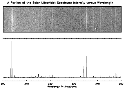
Two different representations of the same spectrum. The top shows an image of a portion of the solar ultraviolet spectrum. The bottom shows a graph of the same spectrum.
Updated: November 2013